Pages

Showing posts with label Coloring. Show all posts

Sunday, March 23, 2014

Art Girl Project: Lent 2014 - Progress Update

So I'm not going to lie - this process has not been easy at all.  After my last post, I almost gave up.  I thought to myself that it was okay to give up...I'm not up for this.  But then I remembered why I was doing this...and what Lent represents...and I decided to go for it.  These were just growing pains.  I decided to take baby steps and make sure I worked on one girl a day.  Sometimes that meant five minutes - other days it meant five hours.  I have to admit I've had my doubts over the last two weeks.  However, this girl is one of the reason's I've kept pushing...


I was really happy with this girl.  She looks a little different now due to paint dripping on the page from other projects - but I'm still totally happy with her.  I used the stamp set from Andrea Gomoll.  I can't say enough good things about her stamps and the beauty of NOT having to draw the details.  It makes life so much easier.

Next up...I tried my hand at drawing the details...


For this girlie, I was inspired by the wonderfully talented Kristin Van Valkenburgh.  She's a really talented artist and my attempt really pales in comparison.  I really love her blog and she shares her mixed media work on Pinterest.  The most important thing is using the inspiration and doing the best job you can.  This represents my best work in that particular moment and time.  I hope someday to get better.  I could go on and on about the problems.  The scale of her face is all wrong.  Her eyes are too far apart.  I really wish I would have done a two page spread.  Her chin and cheek bones are a minor disaster.  However, I love the colors.  I think I did pretty well on the lips and her hair isn't a total loss.

My next art girlie got a two page layout and was inspired by this painting by Paulette Insall.  There are a few photos to show you some of my process.  I made a few mistakes so this girl took me about a week.


If you look at the first picture - I wanted my girl to have a word.  I love the word soulful.  I thought it was perfect for her (at first) then I thought about changing it to soar and adding a bird; as you can see, none of that happened.  When I added the word on the bottom I went to work on another part of the project.  My arm ran through the black paint and I pretty much lost my mind.  I then went to my modeling paste and got to work.  I painted it all over her dress and then colored it with gelatos.  I am so satisfied with the result.  I would love to leave you with this - because I truly love this girl.  However, I thought I'd give you a quick glimpse of my new nemesis.


I have painted this piece of paper more times than I can count.  The sun started out as radiating circles with a melon background.  Then I tried my hand at a sunset (so not there yet) - and finally changed the circles into one smaller sun.  I wish I would have taken pictures.  I've just gessoed her face again and am waiting for it to dry.  Then I am turning the page and doing something new.  I need a break from this girl.  She's driving me nuts.  We are definitely on a break.

So there it is...two weeks of progress.  One somewhat happy "artsy" girl.  I'm not even close to ready to call myself artsy in any kind of real sense.  The important thing is I'm having fun and plugging away.  It's making me happy and that means so much.  I hope everyone is having a wonderful Sunday.  I will keep you updated on my progress.  Until then...

Saturday, March 8, 2014

Artful Beginnings: A Tale of Me and the Girls

As part of my challenge for Lent in 2013 - I chose to do something creative everyday. Specifically I worked on creating scrapbook pages. On some days, I cranked out multiple layouts. And then, on other days I worked slowly - placing a card or choosing a picture. The really beautiful thing about that journey was that it reignited my love for scrapping and being creative. I found that I enjoyed the creative process more and wasn't addicted to the need for lots of words. It was an epiphany and a pleasure. I think that was due in large part to the fact that I had been scrapping for six years at that time and I was trying to get the spark back - that little thing that keeps you going and moving towards being a creative being.

Cut to 2014...I had taken a few classes and started drawing faces aided by the lovely and talented Andrea Gomoll. Her online Facecinating Girls class comes with a stamp set that includes eyes, noses, and lips. It made things so much easier and I really felt successful. I decided to take the Lifebook 2014 class sponsored by Tamara LaPorte at Willowing Arts. I've been doing one or two projects a month since the year started and am really focused on faces.

So I decided that I would do a face a day for Lent this year - I've already changed this. Last year I made the goal to be creative each day in my scrapbooking. I realized a girl a day was a little too much. I'm going back to my previous model...I will be working on one mixed media girl each day with a focus on learning to shade darker skin tones. Tutorials for shading people of color are in short supply pretty much everywhere - so I'm really winging it. This is my fourth day - and truly this is a frustrating task. I realized this morning that it's because I'm a beginner. I know what I like and I can't produce it yet. And it drives me nuts. So instead of waiting to show my great work...I decided to show you my progress so far. Prepare to be underwhelmed and in one case horrified.   


I want to be totally honest...I had a guide for the shading on this one. I will not be sharing that guide because it is truly unfair to the artist that worked so hard to put her class together. I'm a beginner and it shows. I used the stamps from Andrea Gomoll's Facecinating Girls Vol. 2 class and did the rest by myself. I've made a few changes since then - but this was the basic look. I made more hair scribbles in multiple colors. I wanted to throw up after this first try - so horrified.


On the second day - I decided to try distress markers and inks. I was really motivated and inspired by the work of Brett Weldele. I used the stamps from Andrea Gomoll's Volume 1 class and got to work. I actually think this went well. There were only a few major problems. I used very cheap watercolor paper and it started to break down pretty quickly causing some color discoloration and curse words from yours truly. I was pissed at the time but actually like her a lot now. There's a lot to be said for taking a step back and chilling out.


So for those of you thinking - holy shit what did this girl do this time. I'll explain how this poor, sad, hideous girl came to be. My intentions were great. I wanted to use the same materials from my previous girl without the wear and tear on the paper. So I tried gesso and went to work again. I feel sorry for this girl. She's a disaster. She's an 'F." She's a failure - or should I say...the project was a failure. Remember this is just gesso and the EXACT SAME markers and ink. I could go on but there's no need...I decided to do a comparison photo.


OH....one other thing...I drew this girl. I got overconfident and drew the face in ink before I stamped the eyes. I will not be repeating that mistake anytime soon. I just can't handle mastering two skills (sketching and painting) at one time. The difference is huge and makes me love the other girl so much more. At this point I wanted to give up...but I decided to push forward.


This is my latest catastrophe. I used acrylics and a recipe of sorts. I completed this part of the piece yesterday and finished her up today.  This is a really great way for me to work.  It takes the pressure off.  I was really shocked by how she looked last night - I was calling her the ugly creature from Fraggle Rock.  But I'm so much happier with her now...


I'm having trouble with proportions - admittedly.  And her lips are an abomination.  I kept on screwing them up and making them bigger and bigger.  Don't even get me started on the friggin' eyebrows.  However, she's SO much better than the eery muppet from before.  She's a reminder that things DO get better.

So why this long diatribe...I just think it's important to document the beginnings. Beginnings can really suck. In my case it includes cursing, crying, and gnashing of teeth. I often lose the will to live. I often lose the will to make art ever again. I think my supplies should be given to someone else with just a little tiny amount of talent. Then I come to my senses and remember beginnings suck and this is just the growing pains of creating something better. I'll get there. I have the scrapbook pages to prove it.

So here are my new guidelines...
  • I will use Andrea Gomoll's stamps - I'm not spending energy on drawing AND shading. It's too much right now.

  • I will work on a mixed media girl each day. This can range from painting and stamping an entire girl or just painting an iris.

  • I will share my work here weekly.

  • I will share the materials I use when the shading and coloring is successful (by my standards).

  • I will keep my girls in one place as a chronicle of my journey.

  • I will use high quality watercolor paper when using uber-wet mediums.

  • I will be easy on myself. I will relax. I will try to have fun.

Here's hoping it gets better. I hope everyone is having a lovely Saturday! Until then...

BTW: The pictures with additional art was edited using A Beautiful Mess' photo app.

Sunday, August 18, 2013

Comparisons: Distress vs......Distress?

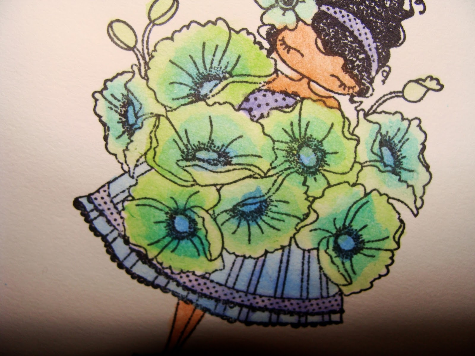
Hi all!  I decided to do a little comparison today with a lovely stamp that found it's way into my stash yesterday.  It's one of Rubbernecker's watercolor stamps and it's whole purpose is  to create beautiful imperfection.  Since this post will be image heavy - I'll try to keep the chatter to a minimum.  Let's start with the image from Rubbernecker.

Original Source: Watercolor Poppies
If you click on the link, there's a pretty great demo video available.  I personally love this set and was super excited to work with it!  While the demo tape uses distress inks and markers to color the images, I thought I'd give distress paints a try as well.  In each picture, the distress paint image is on the left and the distress ink/marker image is on the right.  The final image is colored with distress ink and markers.


A few notes - I really prefer the distress inks and markers for this image with one exception.  I really liked the vibrancy of the first image on the left.  I think the pinks are much more vibrant.  The blue image on the right is my hands down favorite of them all.  I think I might have enjoyed the painted version more if I could have done a better job of lining up the second stamp and would have had the exact same colors.  Sadly, distress paint is not available in tumbled glass or peacock feathers so I was working with a pretty different color palette.  I might give white a try as the base on my next run.  If you want a better look at each sample, click on the picture.

I absolutely can't wait to do more with these sets and play around with a few more solid/brush stroke stamps I have in my stash.  I also have a great idea for some existing flower stamps I have that are outlines.  I'll keep you posted on how things progress.  I'll also start providing full supply information when I've got a better handle on things.  I hope everyone's been doing really well.  Until then...

Friday, July 19, 2013

Friday Fiasco - The Late Version

Today is my good friend's 50th birthday.  Being a self-proclaimed recluse, only big occasions seem to get me out of my house these days.  You would think that with all of that time on my hands I would have had a card prepared before 6:30 pm the night of her birthday dinner...and you would be oh...so...wrong.

Picture this...me in a complete relaxed state watching videos mulling over what new technique I'm going to try on my friend's birthday card.  Picture me choosing this very cool technique from the uber-talented Britta Swiderski.  Picture me reminding myself that things could get dicey BUT IT WILL BE OKAY.  Then picture me sitting down at my craft table to do said technique and basically just losing my shit.  Why?  Because there's a learning curve and no matter how much I prepare myself mentally, I'm never going to be okay with a piece of paper that looks like this...


This is my very unfortunate first attempt.  I decided to give gelatos a try instead of distress ink to change it up a bit.  Rule #1: It is not the best idea to "change it up a bit" when learning something new.  I was frustrated but I pushed on going back to the original instructions.  I ended up with this...


In my opinion, there are a few things that went wrong here.  My color choices were not strong enough.  I really wanted colors similar to the ones used in my first try but I don't have those colors in distress inks.  My friend loves pink and I'm a teal girl - so I was a little stuck (part of the reason I reached for the gelatos first).  I choose to use a yellow spray mist - which really cancelled out the pink and reds I had added from my distress ink stash (spun sugar and worn lipstick).  I'm still not sure what color spray ink to use on a pink project.  My spray mists are uber-saturated and bright.  I thought about throwing in the towel at this point.  But I moved on...


The paper was originally slated to be part of the background of the card.  I had already chosen to use the SHE was a daughter stamp from Unity Stamp Co.  I decided to shift gears and make it the pattern on the dress.  I wasn't so happy with this choice but I REALLY wanted to try and make it work.  Pretty soon I realized there wasn't enough contrast.


So I got out my trusty gelatos and tried to deepen the contrast and even add a little pink and red to the mix.  I wasn't successful in bringing out the pinks and reds - but there was a little more contrast between layers of the dress.  I was somewhat satisfied.  I then moved on to putting the pieces of the card together.  By this time - I had maybe 15 minutes to get everything done so I had to work fast.


And there it is...  the finished card.  Surprisingly, I am really happy with it.  There isn't a strong resemblance to it's original state.  However, I was able to make it work which is really all that matters.  If I had to do it over again - I would stamp the image and color the dress with gelatos.  Unfortunately that wouldn't have been nearly as fun as sweating it out to the finish line (in this case). There were a number of other different errors - the card was too big and I ended up sticking it down and letting it flow over the edges.  I also made a mistake while writing and ended up having to cover the inner part of the card...


Notice the extra portion of the card in brown on the opposite page.  I could not find any envelopes.  I had to put the card in one of those small brown paper bags you get when you buy something small from your LSS.  I stapled it and stamped a birthday balloon on the front.  Done and done.

Anyhoo,  before I head out for the night, I want to leave you with a few things I learned today.

  • Being a beginner sometimes means following directions...EXACTLY.  
  • It's okay to accept your beginner status when trying new things even if you've been doing some other version of that hobby/craft/activity for years.
  • Sometimes you have to accept the mistakes and move on.  Cutting the front of the card down would have been a much bigger mistake than having a 1/4 inch overflow on two sides.  Weigh your options.
  • When things go wrong - reinvent.  I could have totally walked away from my orange background - but I pressed on and I think it worked in my favor.  
  • As always...it's okay to mess up.  It's okay to lose it sometimes.  It's okay to just say screw it and throw your experiment in the trash or to push on and see where it goes.  Both options have value.  Only you can decide what choice is right.  In this case, I had no time and I'm really glad.  

So there it is...two fiascos, lots of steps, and one finished card.  I'm totally ready to try the technique again - staying closer to my own chosen color palette and see where it leads.  I will post the results here.  I hope everyone is having a great Friday evening or Saturday (wherever you are in the world).  Until then...
Friday, June 28, 2013

Friday Fiasco also known as The Time I made an Amalgamation of Crap

I have made the decision to devote Friday blog posts to total effing fiascos and/or failures. Yesterday I mentioned plans to make fifteen cards in a messy, imperfect style by Sunday - clearly showing that I had lost my friggin' mind. I got to work pretty soon after my declaration. These two pieces of paper are the product of my first attempts at mixed media cardmaking.

At this point you might be wondering what products I used. I'm not going to tell you - I think it's a real disservice to the manufacturers. I would feel they were totally justified in telling me to cease and desist in discussing or using their products. I actually like the polka dots on the right. We'll see if it goes on any project. I promise I will share products if and/or when they make the cut.

In the past, I would have thrown in the towel, shook my hands at the heavens, and swore to never pick up another crafty material ever. I would have started to make mental lists of which friends would get my supplies while calling my good friend and cursing her for directing me towards this crafty journey. I am so thankful God has a sense of humor. He must look down at me and laugh or at least I hope...

Moving on...I did not throw in the towel. I made another attempt today. I decided my project on the left fell victim to overly ambitious color choices and should be seen as a a simple mistake, not a complete failure. This is progress people. So I decided to go monochromatic...and then changed my mind (like an idiot).

I stamped a variety of images and it looked okay. And then I decided to add yellow. I was thinking of the paper I planned to use on the cards - and thought it was a GREAT idea. It was not. The paper was saturated with water at the time I took this photo - and maybe even now. When I saw the yellow - I knew I had made a mistake. I tried to correct it by overstamping with the other colors - I don't think it worked. I'm waiting for it to dry and reassessing before declaring it a catastrophe.

At this point you might be wondering when the bitching and moaning is going to end. But here's the thing, most people don't take the time to show their failures. My first attempts suck pretty much unequivocally. Sometimes it takes me years to try something new let alone actually like what I do - I'm really not about the imperfection. And there was a time I would have thrown in the towel and went back to what works for me. The problem is...nothing changes that way - I don't learn anything new. I don't grow or evolve. This is no longer acceptable. So I've decided to share and move forward because I will "master" this...it just might take longer than a few days. Guess what? It's okay. It has to be. Hope everyone is having a nice Friday evening. Until then...

P.S. I will be going back to the "old" way to finish the cards for my friend by Sunday. I'm just not giving up on my mixed-media journey.

Sunday, March 31, 2013

Sunday Confessions

Source Image
Welcome again to a new feature on the blog.  I'm going to try and post a confession at least twice a month.  Don't expect anything too juicy - my life is way too dull for juicy.  Think of these posts as crafty confessions peppered with slightly zany admissions.  Confused yet?  So am I - just a little.  So on to today's confession.

I CAN'T SEE THE LIGHT!

Yes, this is slightly vague but I'll try to make it as clear as possible.  When I refer to "the light" - I am talking about the light in reference to shading and coloring stamped images.  I try to do it with consistency and confidence.  However, I look at blog posts and other people's work with the most confused look on my face.  Frankly, I have no idea what the eff I'm doing.  Over the next couple of weeks, I'm going to do my very best to collect an illuminating amount of resources and ideas (pun intended).  I'll do my absolute best to share my findings and images here - starting with two great resources.
So that's it for now folks!  I hope everyone is having a beautiful and blessed Easter Sunday.  For those of you that do not celebrate Easter, I pray that your day be beautiful and blessed as well.  I'm hoping to fill this day with crafting and a little cleaning.  Until then...

Monday, March 25, 2013

Product Love - Better Late Than Never


There are a lot of great products on the market right now - Derwent Inktense Pencils are definitely high on the list.  I have a really hard time saying no to a lot of things - but these beauties were particularly difficult. I made it a few months - I'm proud to say AND I found them at a really great price point (about $1.05 per pencil with free shipping). So far, I've only got the opportunity to play around with a few images. I thought I'd share a few of my experiments here. Please note: I am definitely a beginner when it comes to using these pencils. There are some great videos on YouTube out there on these products. I would highly recommend looking a little deeper. So without further ado...


This first image is Lulu Loves Poppies from Stamping Bella.  This picture is actually my second go at this sweet girl.  I used what I'm calling the "brush to tip" method to color her.  The basic steps included dipping the brush in water; using the brush to get pigment from the tip of the pencil; and layering color in one direction.  I really liked the softness of these flowers.  I was unimpressed by the dress.


This is my first go at the image.  This is the "pencil, paper, water" technique - again named by yours truly.  The basic steps are to color the image with pencil and then use water to blend.  The colors were much more bright in this example and the blending was a little more seamless.  However, I really missed the lighter color and nuances in the first image.  I didn't realize that until I tried the "brush to tip" method.


The last two images are from Tim Holtz.  I love, love, love these blueprint, birthday images.  I used the "brush to tip" method on both of these images.  I used Canson Mixed Media Paper from an art store and had to give it a little time before adding layers of color.  This gave me a really bright effect in the end and I'm pretty happy with both as a first attempt.

I'm still in the process of learning how to use these wonderful little pencils - but I'm ecstatic to have them as part of my stash.  I will definitely have more images here in the future and will keep everyone posted on my progress.  I hope everyone is having a great Monday.  Until then...

Saturday, July 28, 2012

Baby Shower Thank You Cards

Hello friends!!!  I finally have something crafty to report.  I wanted to share the cards from the June 10 on the 10th post where I tackled the issue of planning and finishing a big project.  I was focused on how to keep things fresh and interesting while getting 50 cards completed.

Now that I'm firmly on the other side of this large crafty commitment, I can breathe a sigh of fresh air and talk about it without turning to blue language or tears.  So without further ado...

As many of you might remember, the momma-to-be was active in the paper decision making and color scheme.  This is an important part of the process.  I definitely felt inspired by the scheme and ended up having more freedom than anticipated in terms of accent colors, design, etc.


This is by far the favored card of the bunch.  My sister (momma-to-be or preggers depending on the day and my mood) loved this card.  She especially loved the paper-pieced shopping bags.  I had planned on doing that on every card - but that flew out the window after the first 10.  I think the Spectrum Noir markers held up well and I like the coloring on this particular card.  The design is a direct copy (or card lift) from the ever-talented Jodi Collins.  You can find her original card here.  I love her style so much.

Next up, is this beauty,


I really loved making this card.  It's another card lift from Jodi Collins.  Find the original here.  I think it's one of my favorites because the amount of layering.  Notice how I've stopped paper piecing at this time and the juiciness of the Spectrum Noir markers is getting the better of me on the leggings.  I'm trying not to sweat those things - even now.

The following card is a simplified version of the one above.  I had grand plans to liven this one up a little more but it didn't happen.  I also planned on paper piecing the bags, another thing that didn't happen.  Insert sigh here.


Next up, is another Jodi Collins inspired card.  Have I said I love her work enough yet?  Find the original here.  I really love what SHE did with the card.  I think my interpretation is really lacking.


Frankly, there is too much pattern going on here.  I never thought I'd utter the words.  There is no where for the eye to rest - a really big problem in design.  I should have considered that more.  Also notice how I've stopped the intricate blending on the images.  This was one of the last designs and my arthritic hand was screaming for mercy.

The next card was inspired by this sketch from Retro Sketches.


Retro Sketches: Original Source


This was my favorite paper.  I didn't have a lot of it and I was just SURE I was going to rock these out.  I thought the heavens were going to open and sing at this finished card.  Guess what?  I hate the end result.  Sometimes life is just like that.  I wanted to tear them up - but a girl's got to get here order done.

And finally last but not least is this little dear...


I almost kept this one.  It was in the height of my blending phase and I was playing with sky colors.  I loved the end result even if the shading around the girl is a little purple for my taste.  This card was inspired by one of the earliest sketches on the Mojo Monday blog.  You can find the original here.  I really love the finished product on this one....

So that's it for now.  I'll be back in a few days with a list of things I learned from this project.  I have big plans with Starbucks and my local book store today.  Going to do some reading and try to resist buying any of the lovely books.  Hope everyone has a great Saturday.  Until then...

Monday, June 11, 2012

New Marker Love - Spectrum Noir

Today's product love is brought to you with a big smile and a lot of hope.  This product is actually not something I'm lusting over (shocker)...but something that lives in my home as I write and breathe.  Actually - it's 72 things...72 Spectrum Noir markers to be precise.

I've had these markers in my house for almost 72 hours (this is totally unintentional I assure you) and I'm learning slowly.  I bought the basic packs (12 packs with six markers) which covers the colors of the rainbow, neutrals, and skin tones (which they call pale hues).  I had literally never heard of this marker before I bought my first 36.  I just roll like that - I'm a nutcake as my mother would say!

How did I come to learn about these markers let alone buy 72?  It's a funny story (please feel free to skip this paragraph if you are uninterested).  I was actually going to buy Copic markers.  I had sat down with my paper and determined which markers I needed and then went to the booth with the lowest price.  Now - this should have been easy enough.  However - the vendor had made the brainy choice to place their markers next to their purchase line.  The line was incredibly long and I couldn't get to the markers.  A very nice woman waiting in line gave me a quick tip - these markers were cheaper around the corner.  I had scoured the whole place so I wasn't quite sure which booth she was suggesting - but like a good girl I went looking.  It turned out the booth had sketch markers, not ciao, putting them way out of my budget.  So...I knew it was going to be a waiting game to get the markers at the busy, unorganized previous booth.  I started wandering around and found myself in Bee Creative's booth.  One of the nice ladies doing a demo was talking about the markers and giving some basic information.  I looked at the deals and quickly realized I could get 36 markers instead of 16.  I was sold instantaneously.  I noticed the specially formulated paper but could not afford it - so I moved on with my new pack of six markers.

That night I came home and played using mixed media paper from my Canson Mixed-Media Pad.  I had watched a few videos and knew the markers were "juicy".  I did my very best not to be heavy handed.  I quickly realized this paper was not going to work...

 
I actually liked the color palette - but the bleeding was too much of a distraction.  I also realized I was not blending the colors as suggested on the charts (more on that later).  The numbers were difficult to read on my packaging.  However...I could see these markers were going to work and would be a fine replacement for my budget at less than $2 per marker.  Please note: I did not have the foresight to record my color choices.

The next day all I could really think about was getting back to that booth and buying the rest of the colors and the specially formulated paper.  So what's a girl to do - well...call in reinforcements of course.  I talked to my special benefactor - and she gave me the money for the additional 6 sets!!!  Since I'm working on cards for my sister and parents - she was more than willing to help out.  Thanks Ma!!!!  So I headed out and bought the remaining sets and paper.  I was ecstatic.

Once I got home, I reorganized my marker stash banishing my ultra fine tip Sharpies to a basket to be taken to work when summer school begins.  After I was happy with the new arrangement...I started to play using the special paper and here's what I got...

Right Image: Shirt (CT4, GB5, OR1), Pants (IG1, IG2, IG4), Two Bags - same color (BT1, BT2, BT4), Boots, (CT4, GB5, GB8); Left Image: Shirt & Boots (CT4, GB5, GB8), Two Bags - same color (BT5, BT7, BT9), One Bag (TB3, TB5, TB6, and TB9), Boot strap (EB8)

Sorry for the big picture - but I thought it was a better size to view my "findings."  My first attempt is on the left.  Using the Indie Chic Nutmeg line as my color inspiration, it became clear that blending the three warm colors was creating an orange effect - something I definitely did NOT want.  Also - the bags weren't the right color and just weren't dark enough.  So I substituted the orange color for a light brown on the boots and liked the finished effect.

I then moved on to the image on the right using my new found knowledge.  The yellow color of the shirt and boots worked wonderfully.  I alternated coloring different parts of the image to minimize the amount of bleeding.  I was worried it would make blending more difficult - but it didn't.  I then moved on to the bags and really liked the darker blue green colors.  Then I moved on to the last bag and really broke the bank.  I used far too much ink covering up a lighter blue shade that just wasn't working.  In the end, I have the colors I want - just in a juicy form.  So I separated out the colors and made sure to write each blend down for later reference.  My plan is to start cranking a few of these out today sans heavy bleeding.  I'll keep you updated on how it goes.

In the meantime, I wanted to leave you with a few resources I have found helpful if you choose to try out these markers.

  • Youtube.com - Do a search for Spectrum Noir markers and a variety of videos are available.  There are even some videos comparing different alcohol based markers.
  • Trena's Stamp Headquarters - She has a lovely blending chart she has created (which I downloaded to my iPad).  She also has a blank chart to allow for your own play time.  It's a really great source.
  • Spectrum Noir Blog, Video Tutorials, & Downloads - there is a lot of good information here, including blending charts and a coloring chart to keep track of the colors in your stash.  
I hope you find this very long post helpful.  I hope you're having a wonderful Monday.  My day is looking to be a rainy one with isolated thunder storms - my favorite (NOT!).  Here's to a productive crafty day and to you.  Until then...
Related Posts Plugin for WordPress, Blogger...

Site Info